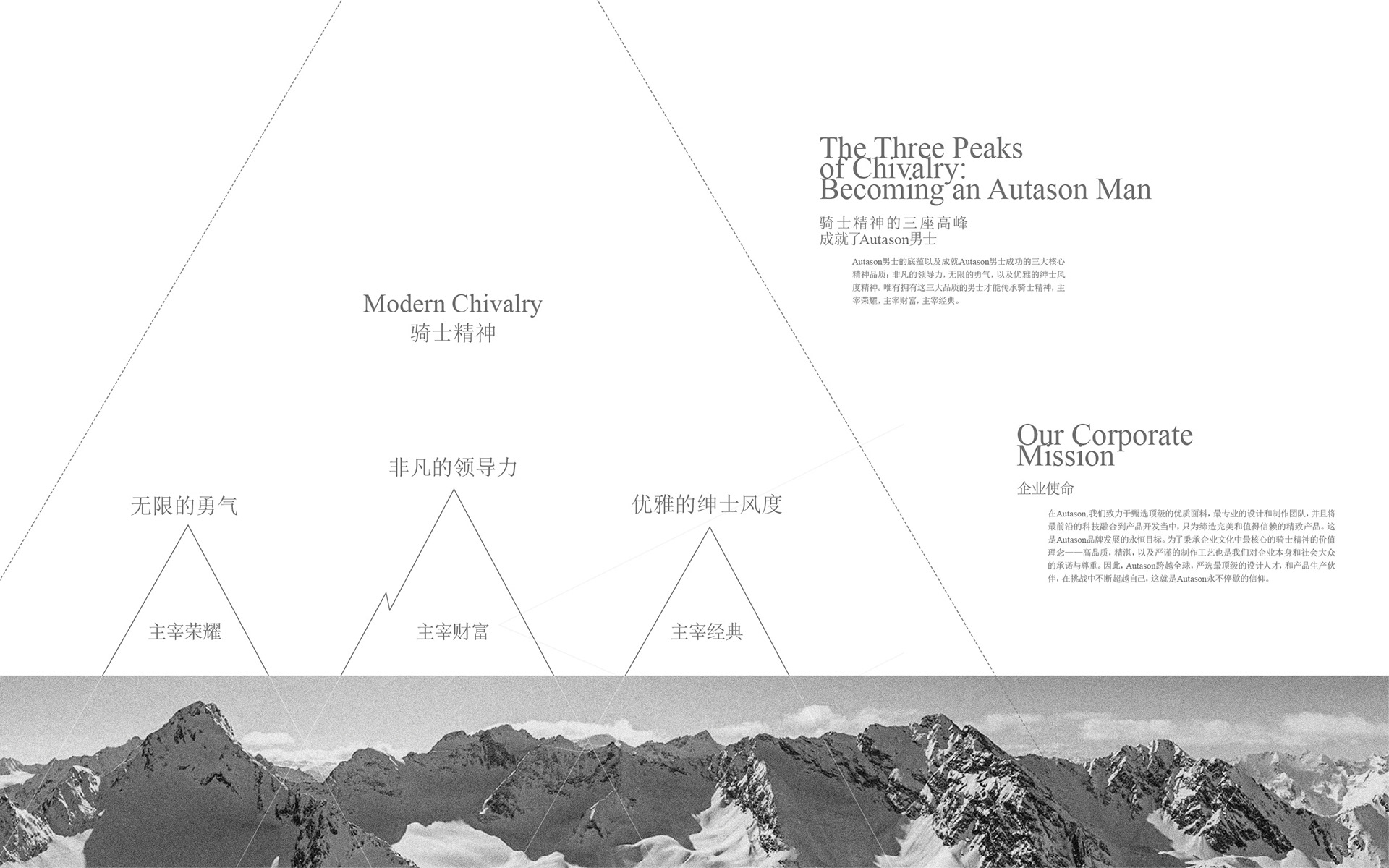
AUTASON is a high-end menswear brand with over 100 stores nationwide. It is part of the Heilan Group’s portfolio of brands, one of China’s Top 500 Enterprises.
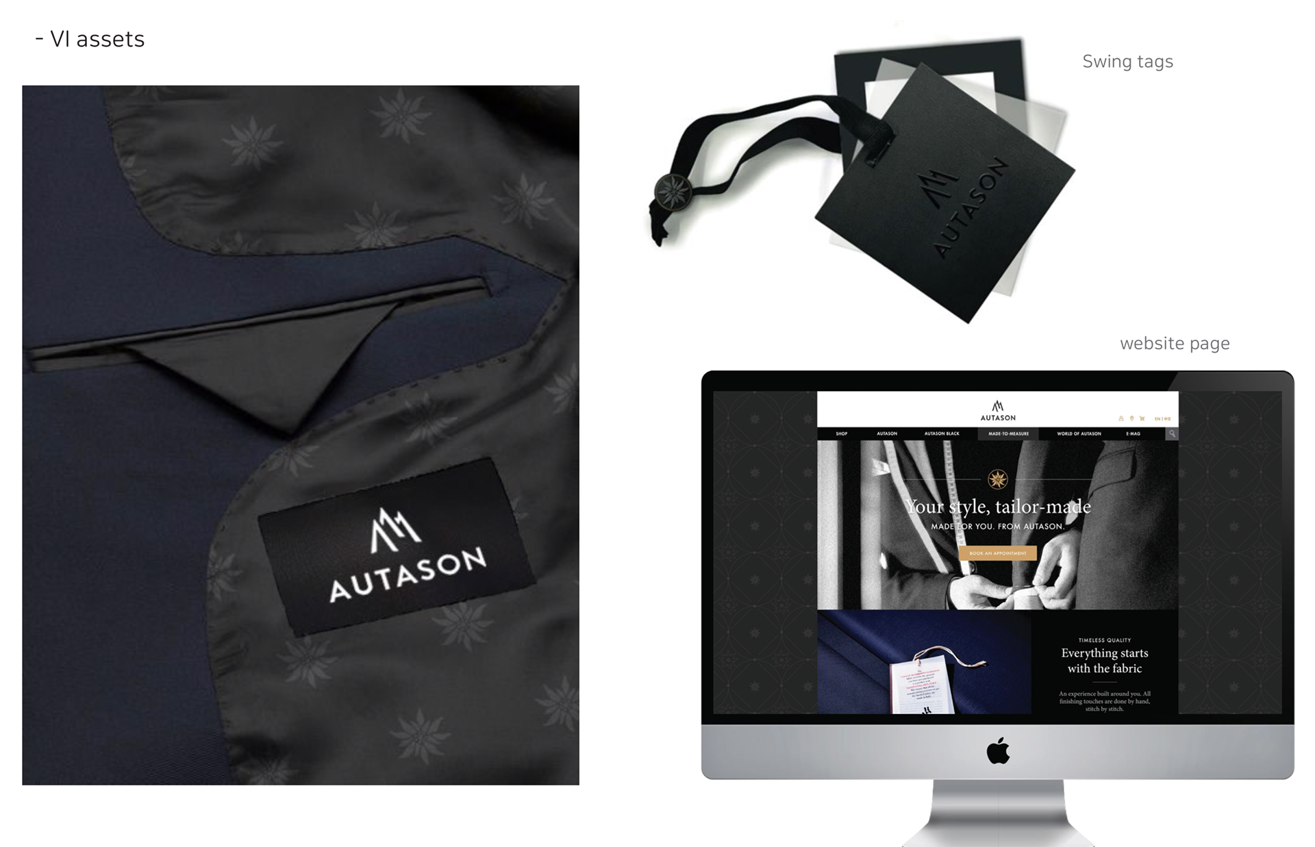
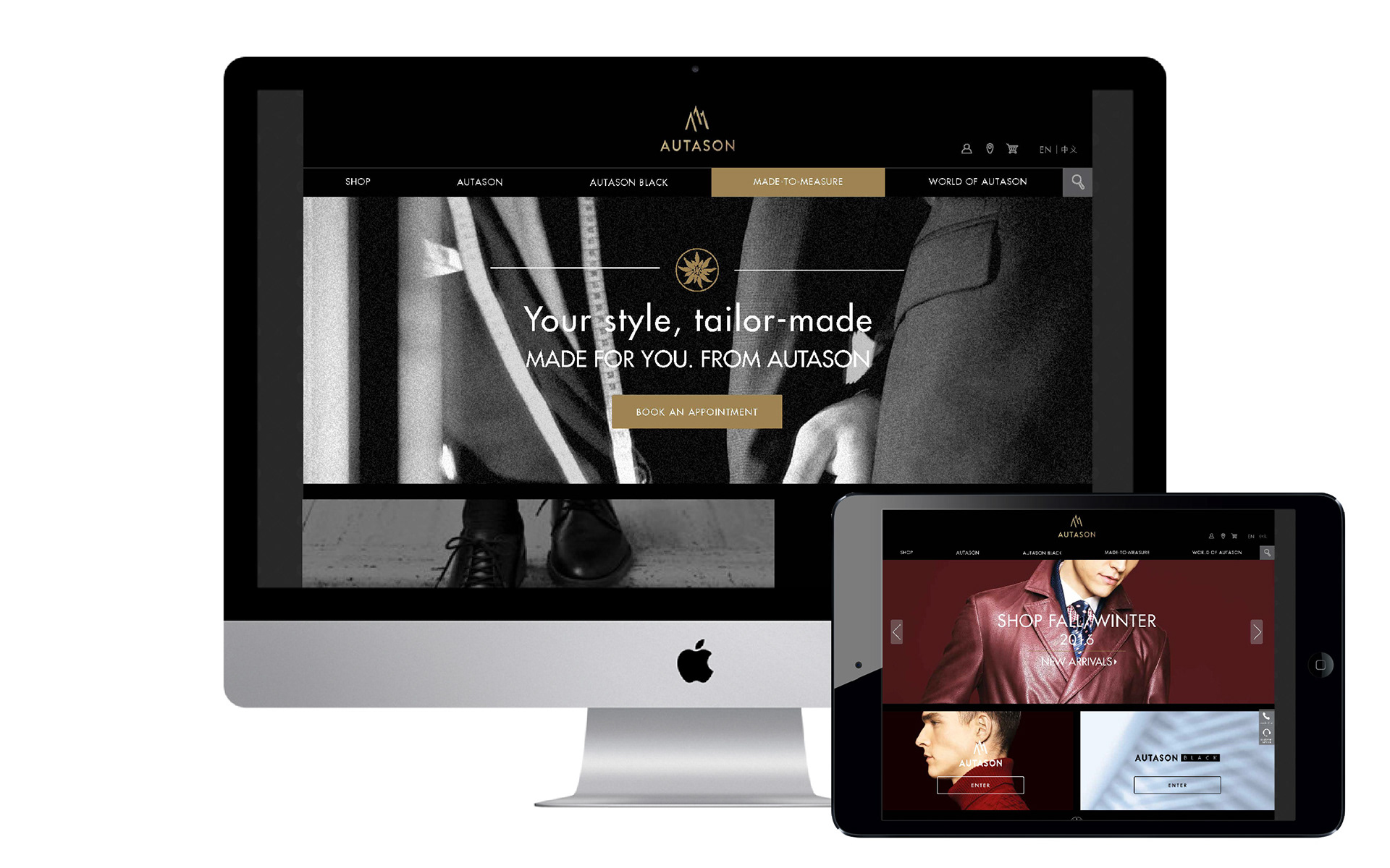
We gave the brand a complete overhaul with a new visual identity, including a new logo. We relooked at AUTASON’s brand story and found a more compelling way to talk about it. In line with the new identity, we also produced a new website and commercial for the brand.
We gave the brand a complete overhaul with a new visual identity, including a new logo. We relooked at AUTASON’s brand story and found a more compelling way to talk about it. In line with the new identity, we also produced a new website and commercial for the brand.
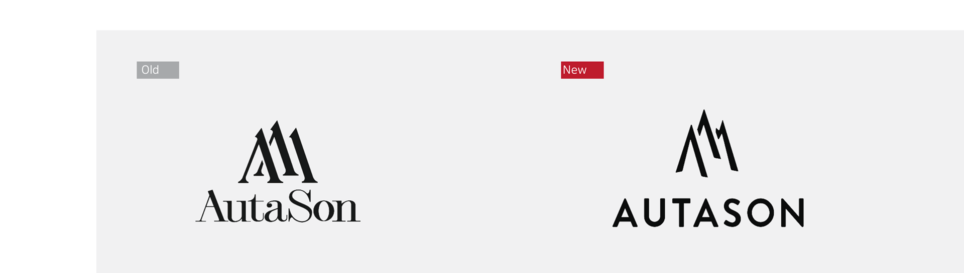
기존 로고에서 모던함과 완성도를 높여 재해석 된 로고입니다. 브랜드 히스토리부터 연결되는 도전, 용맹함, 알프스 산맥을 모티브로 하였으며, 동시에 탑 에이 클라스 퀄리티를 표현합니다.
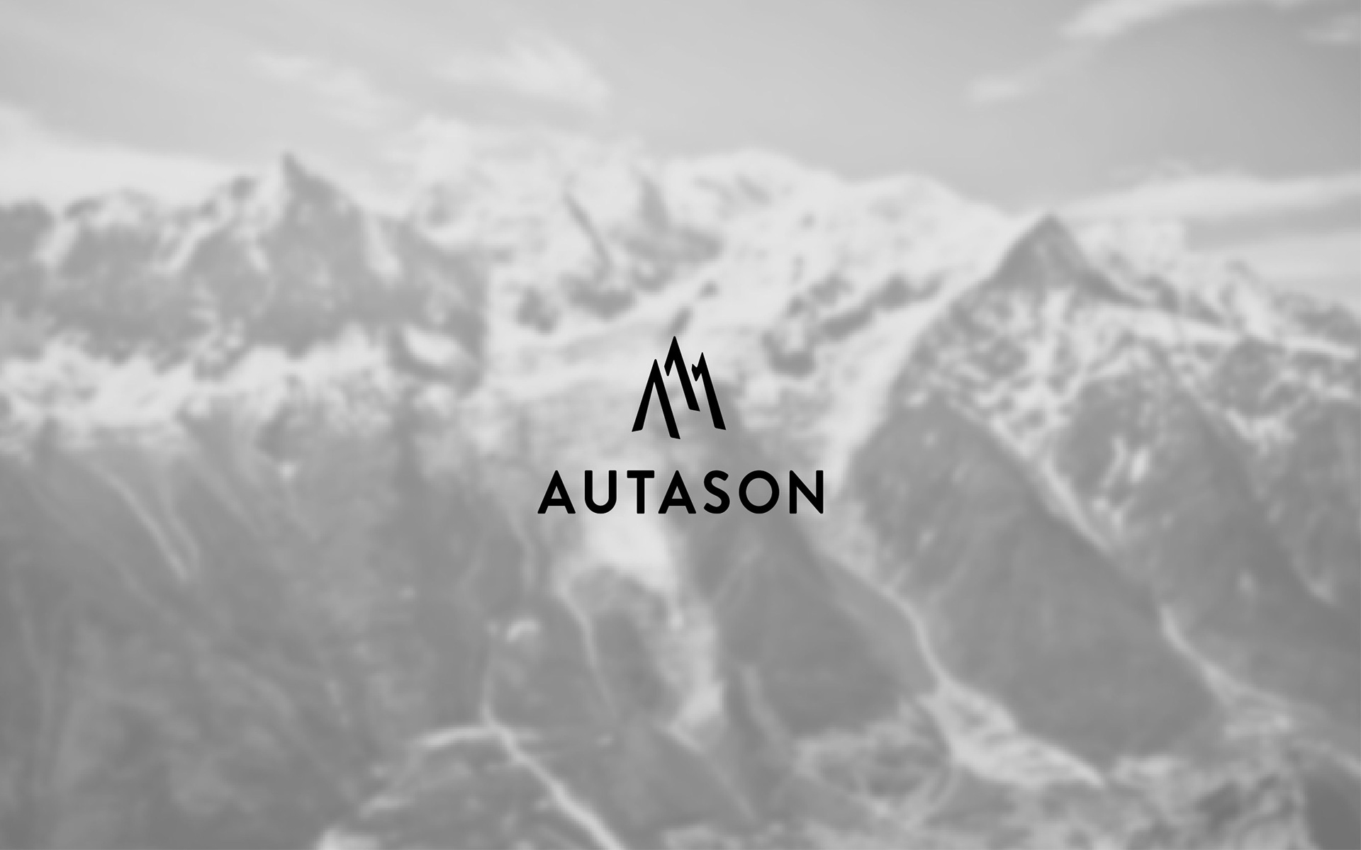
The brand logo is inspired by the brave and courageous spirit of the knight spirit - the three A generation.
Also, it represents the table of the mountain, challenges, and the top A class quality.
Also, it represents the table of the mountain, challenges, and the top A class quality.
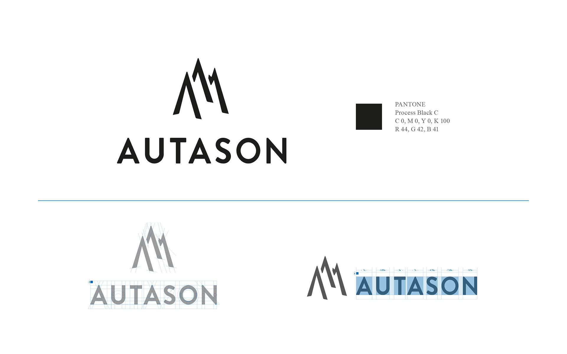
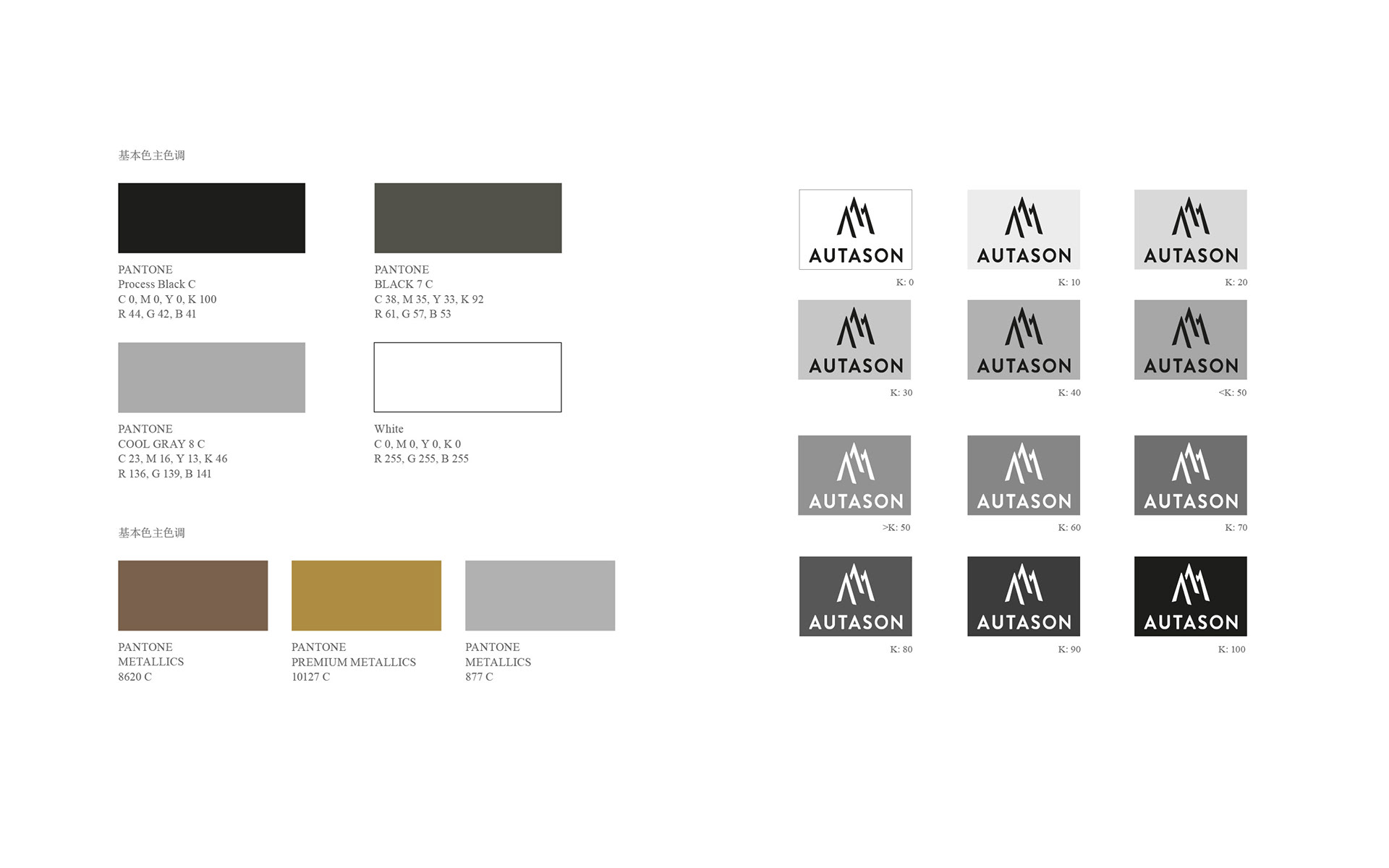
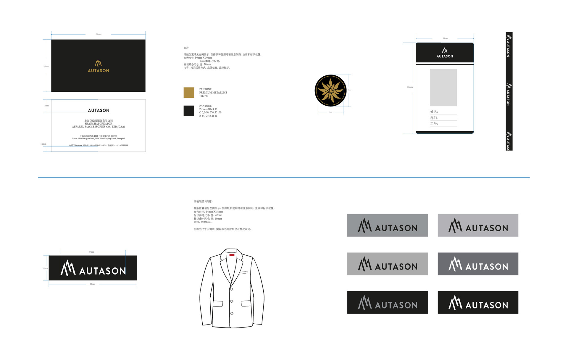
The main color of the brand is black, gray, and white-based. It reflects the elegant style of the brand: successful, positive and elegant. Metallic colors are mainly silver-based. It reflects the brand's fashion, the pursuit of quality and expresses the elegant style of the modern city.
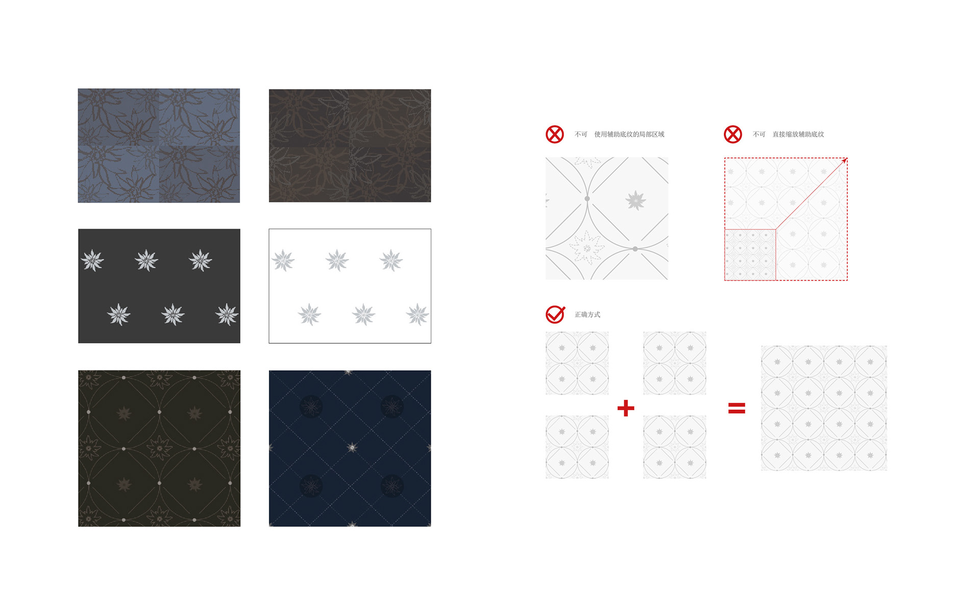
The auxiliary graphics is an important part of the VI system which can enrich the overall content and strengthen corporate image in the media. Autason's philosophy is fully reflected in the aiding graphics that are based on Edelweiss.