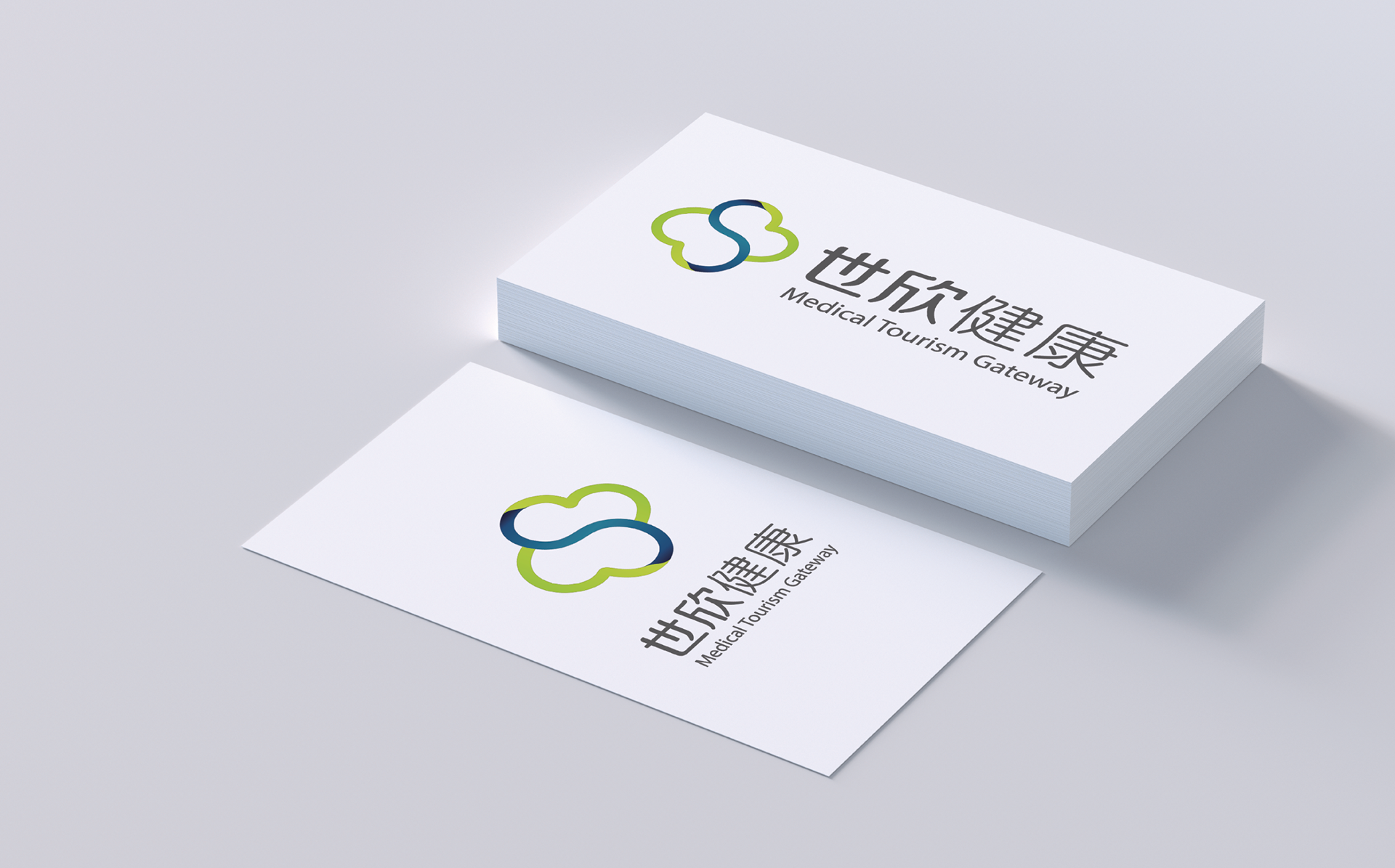
SHIXIN HEALTH Premium medical tour branding - ShiXin Health는 프리미엄 메디컬 투어 서비스를 제공하는 브랜드입니다. 기업이 추구하는 가치를 잘 보여줄 수 있는 로고와 어플 아이콘 디자인을 진행하였습니다.
ShiXin Health is a brand that offers premium medical tour services. We have designed logos and application icons to show the value of the company.
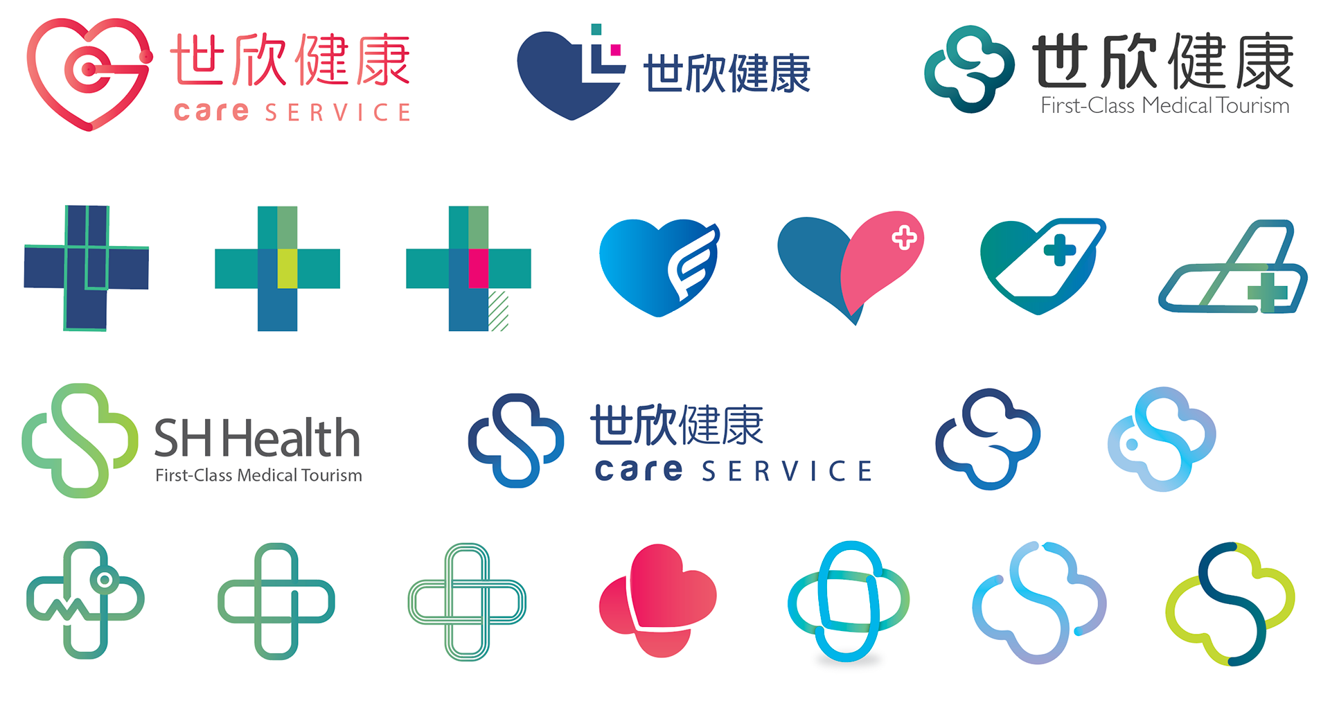
L O G O I D E A T I O N
전문성을 나타내는 파랑과 초록색, 메디컬 케어를 나타내는 빨간색을 메인 컬러로 사용하였고, 크로스, 하트, 비행기 등을 표현하는 심플한 아이콘을 심볼로 사용하여 어떤 서비스를 제공하는지 직관적으로 전달하고자 하였습니다
Mainly made use of blue and green to illustrate professionalism, and red to illustrate medical care. Also, used simple iconography to illustrate what they do in a simple and direct way, for example using a cross, heart, airplane, etc.
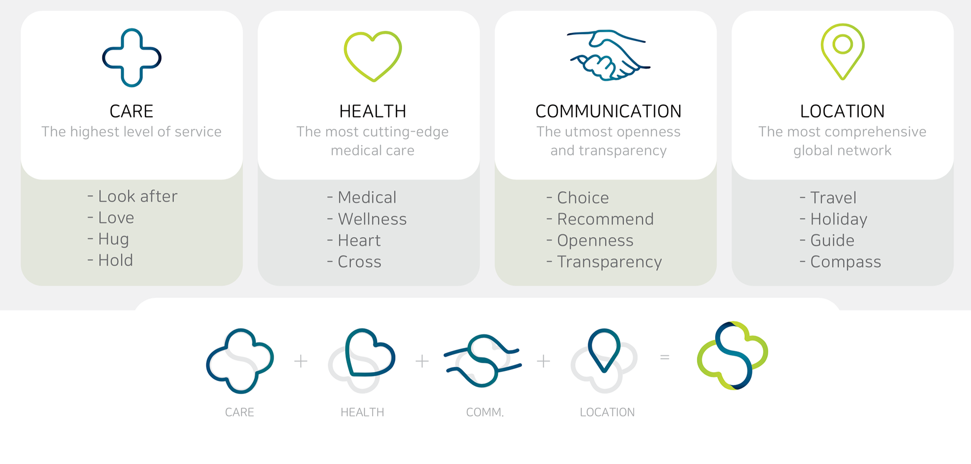
T H E 4 P H I L L A R S A N D D E S I G N E V O L U T I O N
ShiXin의 네가지 핵심 가치를 성립하여 다른 브랜드와 차별화 될 수 있도록 하였습니다. 또한 위의 네가지 구성 요소의 결합을 시각화하여 서비스가 추구하는 가치를 사용자에게 효과적으로 전달하고자 하였습니다.
These pillars are also ShiXin’s points of differentiation and, when combined, what make ShiXin’s service unique from others. It aims to visualize the combination of the above components, so that the service’s entire value proposition begins to be communicated to consumers from the moment they first come across the service and lay their eyes on the logo.